

The Material Design System by Google is definitely one of the most popular design systems. It is broad enough to allow designers to get creative and simple enough for developers to easily implement it. But what are some common mistakes people new to the concept make? We’ve collected 7 of them here for you!
1. Forgetting about Elevation
Elevation as well as borders are crucial in Material Design, they are what make it possible to distinguish different layers and materials from each other. People often try to make their UI especially flat, thinking this is what Material is all about, this often results in hard to use UI for end users.

2. Using Google’s Material Theme for everything
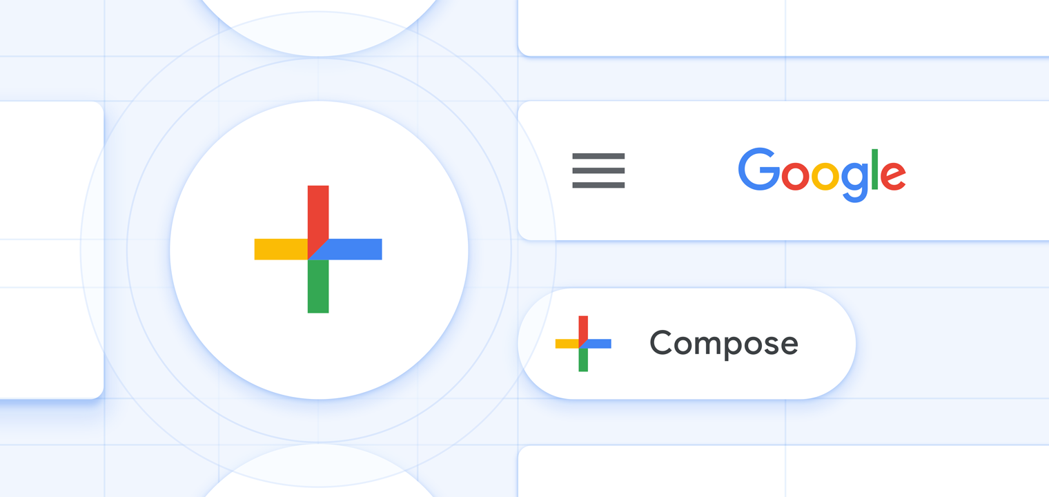
The idea of the Material Theme system introduced in late 2018 is to allow brands to express themselves while still adhering to a common ruleset. Previous versions of Material Design were pretty limiting in what kind of shapes and colors it allows, which resulted in a lot of products not adapting the guidelines. Admittedly Google’s Theme is one of the most beautiful ones out there right now and you can certainly take inspiration from it, but the idea of Material Themes isn’t that everyone should copy Google’s rounded theme, with blue accents and Google Sans. Be brave and create your own look & feel within the bounds of Material Design.
No, there is no such thing as ‘Material Design 2’
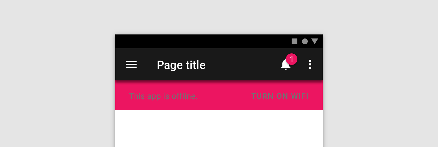
3. Using gray text on colored surfaces
Text legibility and contrast are extremely important, not only should your application be great to look at, but you also shouldn’t forget about accessibility. Putting opaque gray text on colored surfaces is a no-go for both these things.
4. Using formal language in copy
The Material Design guidelines have an entire section on communication which I really like to consult. Most people (especially developers) tend to write over complicated text, and the more serious your project gets the more prone you are to start using formal language. Try to not use overly formal language, especially in languages like German with a complicated set of rules for formal writing. Be personal, but don’t intimidate the user (you’re most probably not working on Discord). Just try to keep in mind you’re not writing a novel and your users shouldn’t need to read a novel to understand your UI.
5. Using Gel- or Liquid-like surfaces
Materials in Material Design are paper like surfaces, they are thin (1dp to be exact) and have solid properties. If your Surface behaves anything like a liquid or even a gel you’re doing it wrong. (Surfaces can obviously contain content like images or animations which do resemble fluids).

6. Using gas like surfaces
why are you even doing this, this makes absolutely no sense and I am pretty sure this is a federal crime.
7. Forgetting to use Material Design at all
Some people seem to attempt to use Material Design but completely forget to actually do so. This is probably the worst you can do, because this is when you use Holo themes, Material components and no common sense (so basically when you develop something only to be used by nerds).


